Sequel is a period care company rethinking how the category presents itself in the world.
Concept
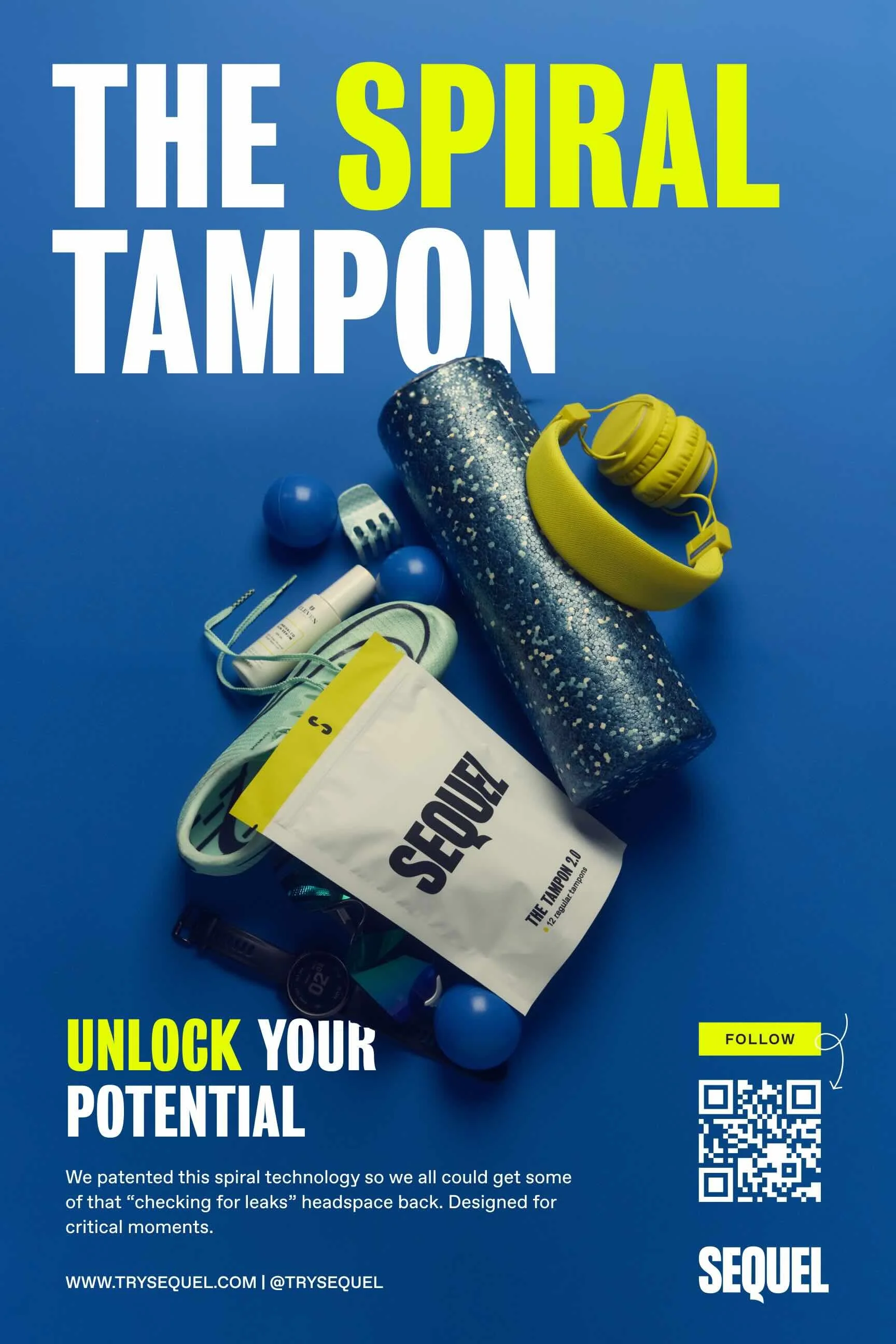
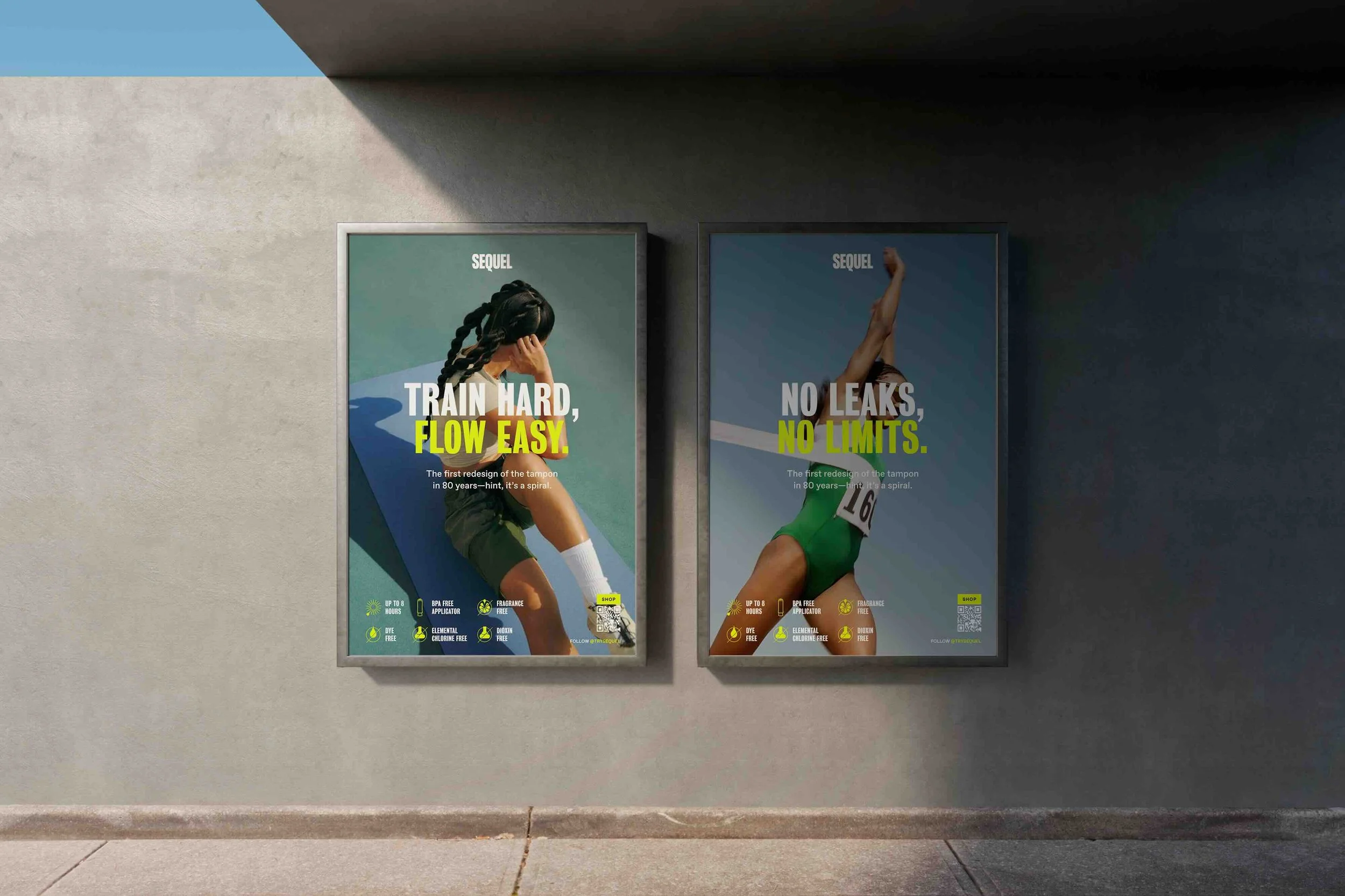
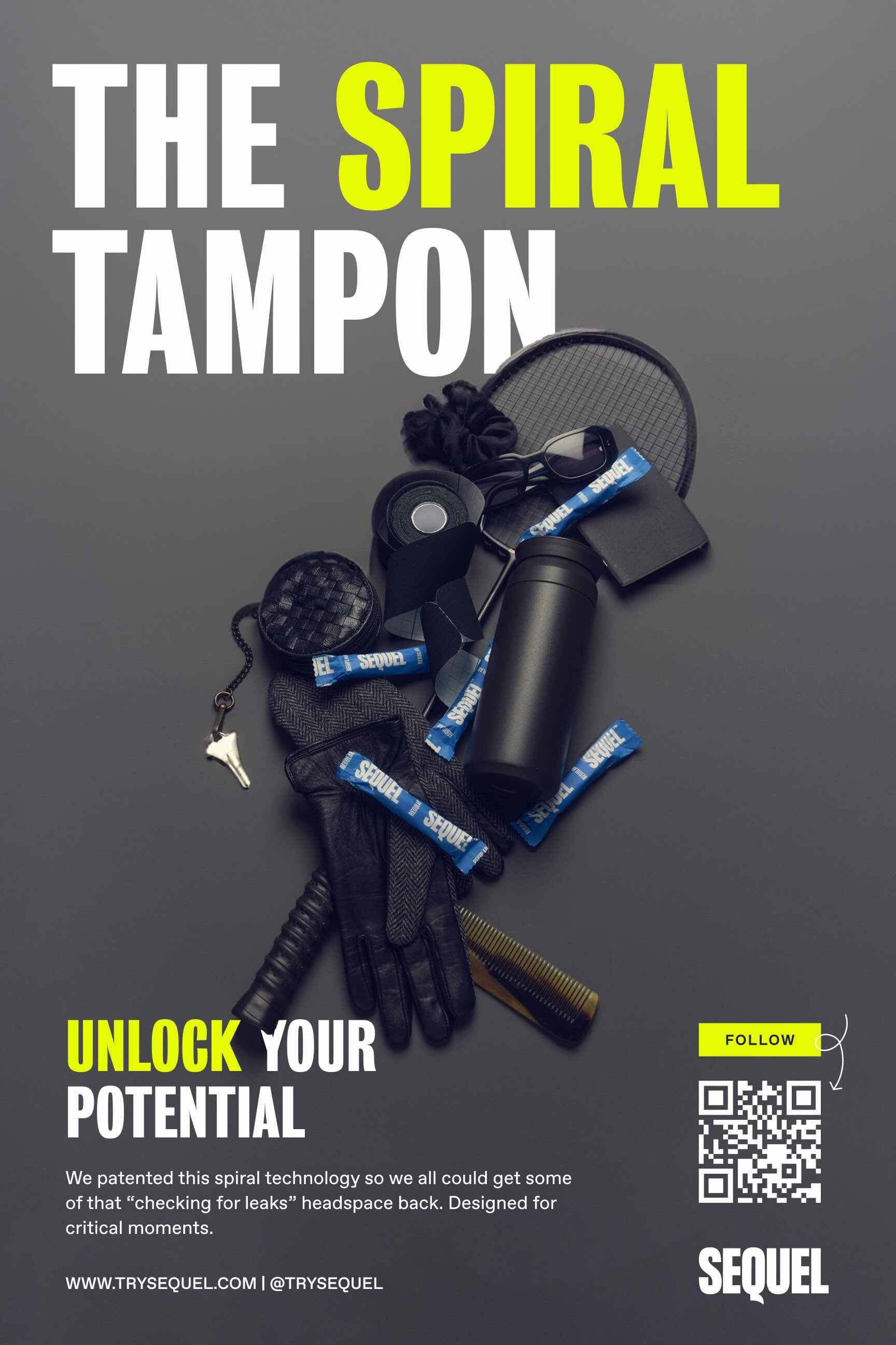
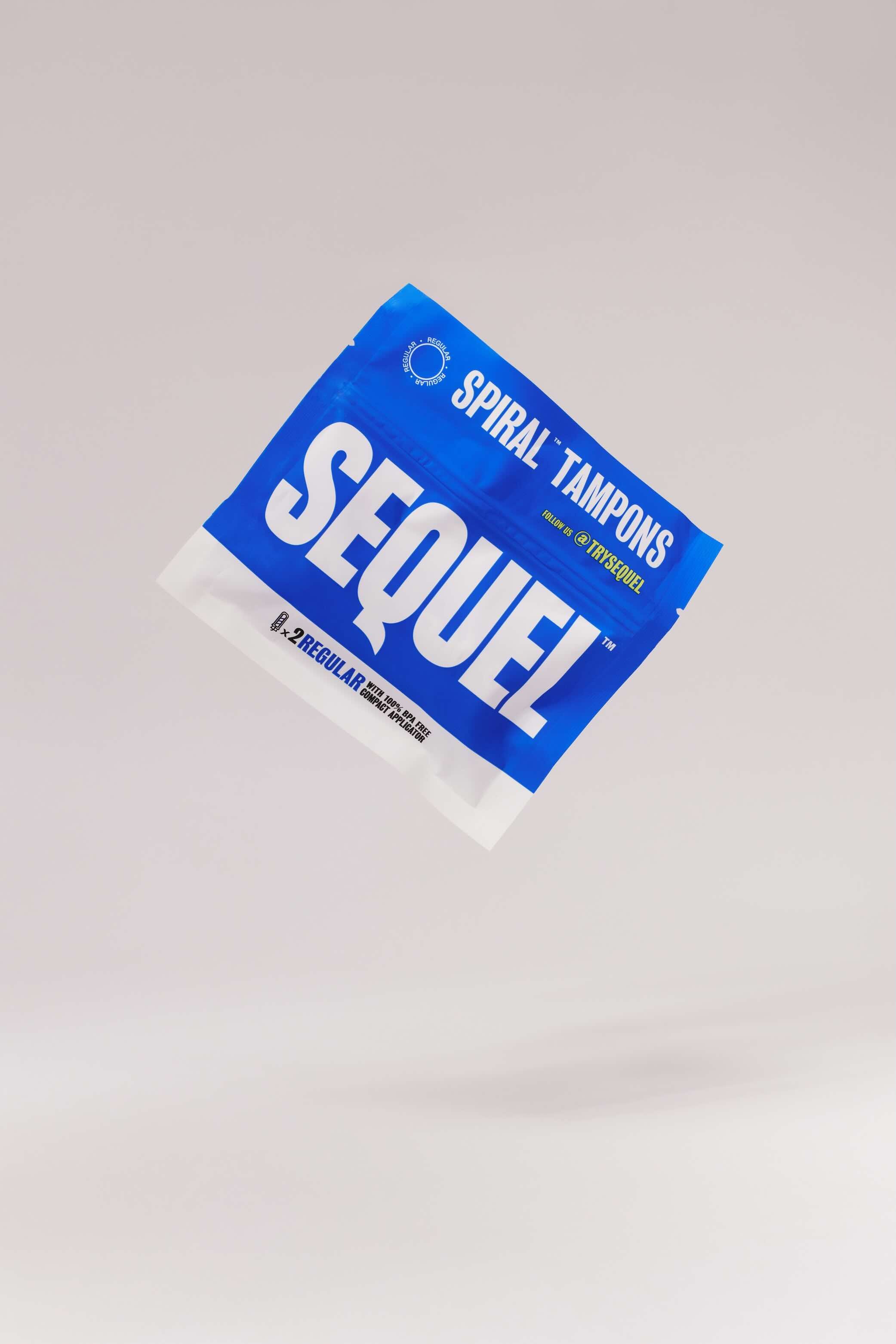
Period care brands have historically operated in a register of softness, discretion, and apology. Sequel asked a different question: what if it looked like it belonged on the same shelf as the most confident brands in the world?
Approach
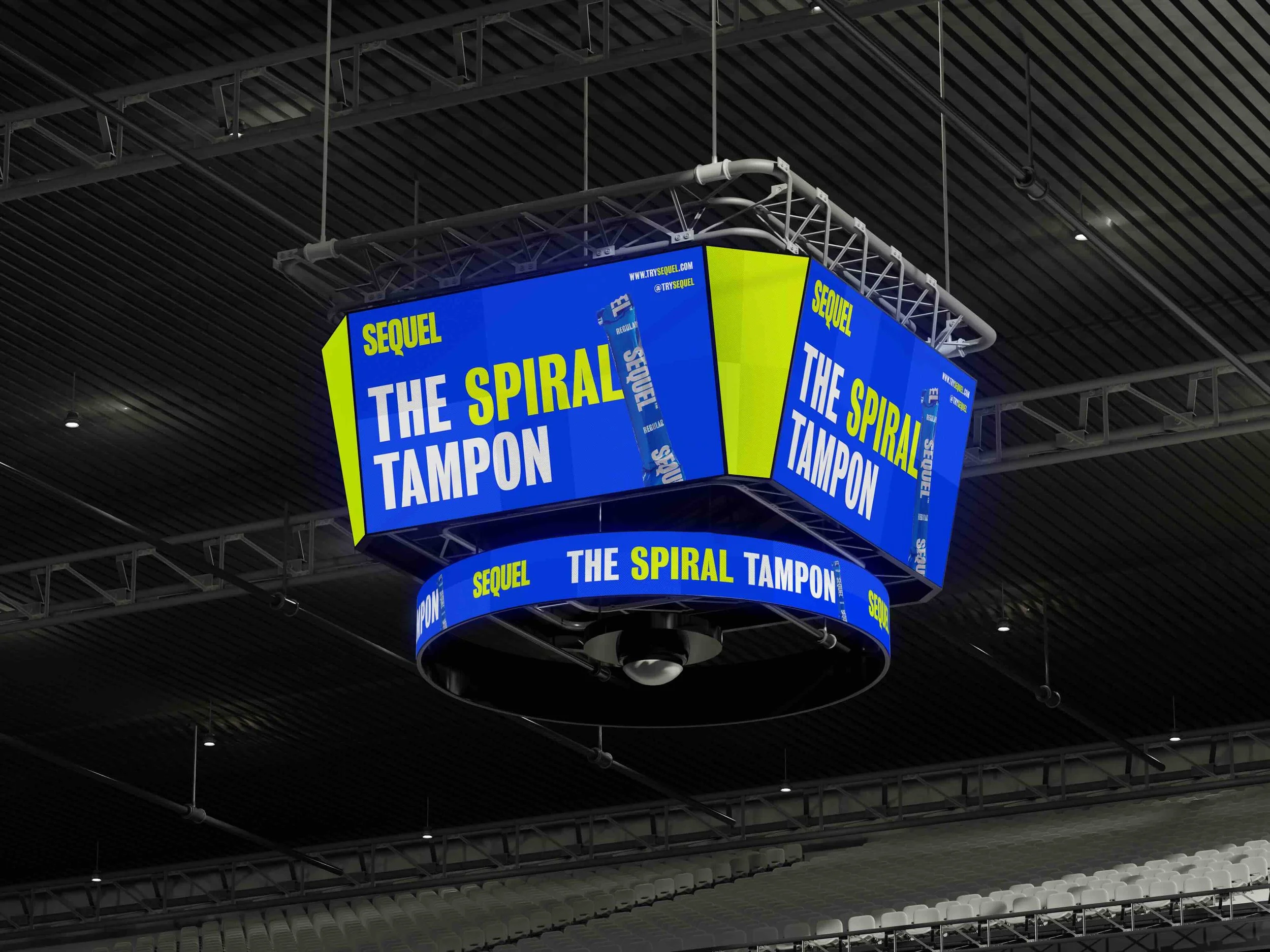
Set the visual direction for campaign and packaging — high-contrast color, oversized typography, and compositions designed to stop someone mid-scroll or mid-step. Unified message and image across OOH, digital, and retail, so the brand reads consistently at every scale.
Outcome
A visual system that earns attention rather than apologizing for taking it — positioning Sequel as a brand that belongs in the cultural conversation.
Role: Campaign, Packaging & OOH